typography
Typography is the core element of our brand identity.
It is synonymous with our brand, making it easily identifiable.
typography.
In our identity, we utilize the typeface Instrument Sans. This versatile family, with its array of weights and widths, represents our favorite qualities in a sans-serif while incorporating contemporary elements that make it unique.
We use the regular uppercase font for our super headings and a medium font for our first lowercase headings, which ends with a period. For body text, we use a medium font that is in normal uppercase and lowercase.
Instrument Sans
We use Instrument Sans throughout our brand identity. It's a Google font that's free to use for commercial purposes and available in the Google suite of tools like Google Slides and Google Docs.
You can download it here.
For web applications please refer to the following sizes below.
font sizes
Base font 17px = 1rem
HEADLINE 1
8.8rem | regular | line-height 84%
headline 2.
4.8rem | medium | line-height 84%
Headline 3
3.2rem | medium | line-height 93%
Headline 4
2.1rem | medium | line-height 93%
Paragraph 1
1.9rem | medium | line-height auto
Paragraph 2
1.5rem | medium | line-height auto
Paragraph 3
1rem | medium | line-height auto
typeface color
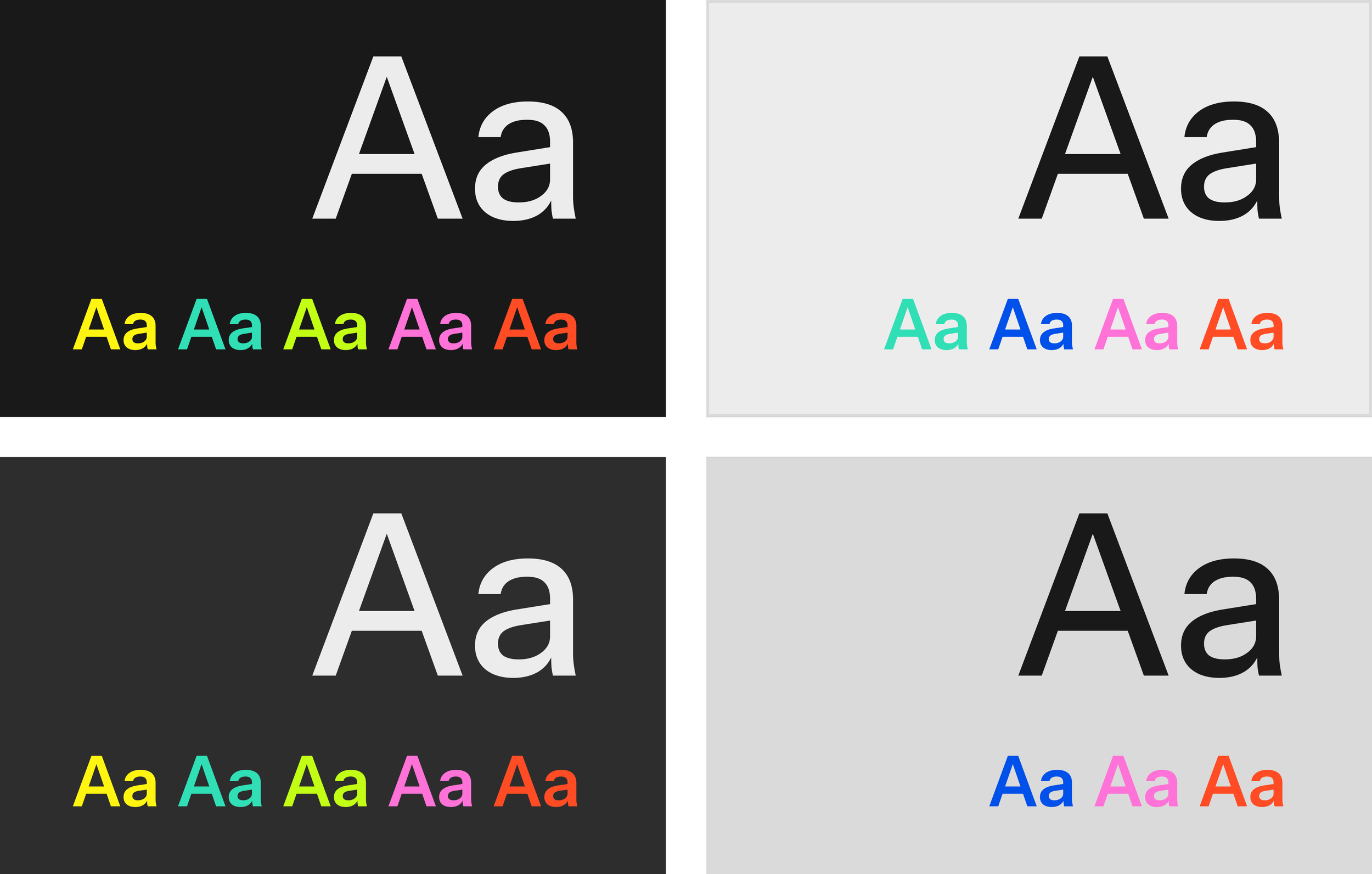
When combining our core palette with typography, look for consistency across all formats.
Dark and Light are always usable with the opposite background to generate contrast and readability.
You can color H1 and H2 text in the color you like, as long as there’s enough contrast with the background.
If you use a colored background refrain from using any color in any text element and stick to either Dark or Light.
On the right, you have a cheat sheet of what colors can be used for each of the backgrounds (dark and light).
Never combine multiple colors in the same application.
do nots.
Here are some tips to help you stay on track. The most important thing is to always be careful and double-check when setting up your fonts.


